

 celebrates with forward Kevin Garnett (21) against the Los Angeles Clippers at Target Center. The Clippers defeated the Timberwolves 110-106. Mandatory Credit: Brace Hemmelgarn-USA TODAY Sports")
 drives in against Minnesota Timberwolves center Karl-Anthony Towns (32) in the third quarter at Sleep Train Arena. The Minnesota Timberwolves defeated the Sacramento Kings 105 to 97. Mandatory Credit: Neville E. Guard-USA TODAY Sports")
Let’s start with the most recent team to make a significant change, the Sacramento Kings. They have a great new logo, and a pretty solid new set of new uniforms as well. That alternate light blue jersey is just a thing of absolute beauty and should remind many Minnesota sports fans of one of the Twins’ best throwbacks.
What the Kings’ logo nails are the quintessential aspects needed to succeed with a re-brand: it’s a simple yet unique design and pays due tribute to both the city’s and franchise’s past.
They ditched the far too busy over-designed predecessor (so typical of a 90’s NBA logo) for a clean, yet bold modern design. It pays great tribute to the franchise’s earlier days by mimicking the original design of the Cincinnati Kings logo but keeps the current purple and black primary color scheme that Sacramento made their own.
The main uniforms leave much more room for nitpicking though, in my opinion. The letter bordering is unnecessary and the grey on the sides of the jersey creates a busier look. It would have a much cleaner and classier appearance if they just left the sides as purple on the white unis and white on the purple ones. The logo is already a great look on the shorts, why muddy it up with the grey?
More from Dunking with Wolves
- The dream starting 5 for Minnesota Timberwolves 5 years from now
- Anthony Edwards’ latest accolade is a great sign of things to come
- In an OT thriller, Team Canada snatches Bronze from Team USA
- Timberwolves start, bench, cut: Mike Conley, Shake Milton, Jordan McLaughlin
- Which Timberwolves roster additions have upgraded the bench?
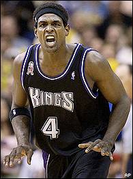
Also, I think the Kings made a big miss with the black alternate jersey. When you’re a franchise without much tradition to bank on, a la the Timberwolves, you’ve got to show some respect to rare times when the team was relevant. The best era of the King’s (early ’00’s) had a great black uniform and they clearly missed a chance to pay tribute to their only championship-worthy squads.
Or maybe that black uniform wasn’t all that great but it just reminds us all of those entertaining-as-hell teams that came oh-so-close to knocking off the Lakers? On the other hand, that’s the benefit of nostalgia, isn’t it?
That era of Sacramento basketball was probably one of the main times in that city’s history when its residents (Sacramentites? Sacramentons?) could walk around with a level of cache, and that means something.
Despite the nitpicking, however, I like the uniforms on a whole and the general consensus has been positive as well.
I really like how they stuck with the purple and black color schemes and their decision to scrap ‘Sacramento’ for just ‘SAC’ is a nice touch that the Minnesota Timberwolves should implement as well. More on that later though!
Let’s move on to another team that recently made a phenomenal logo and uniform overhaul…
Next: The Philadelphia 76ers Updated Unis