

")

No. 15: 2008-10 White
Pretty sure that if we introduced these as the “ugly white” jerseys, y’all would know what we were talking about.
Look at those things (pictured above). If you can ignore the players that are actually wearing the jerseys — although four of the six players pictured above were still in the league last year — concentrate on just how hideous the uniforms themselves were.
The attempt at keeping the somewhat iconic treeline on the collar from the Garnett era was misguided at best, as it turned into a collar with three very different parts to it. There was also the forced inclusion of the trees on the side of the shorts.
While the collar is the biggest issue with these, the font is a tweaked and uglier version of the Garnett-era font, and the shade of green that they went with is terrible, too.
To make matters worse, the 2008-09 and 2009-10 went a combined 39-125 under a combination of Randy Wittman, Kevin McHale, and Kurt Rambis. Gross.
No. 14: 2008-10 Blue
These jerseys had all the same problems as the above; the base blue simply helped hide some of the issues.
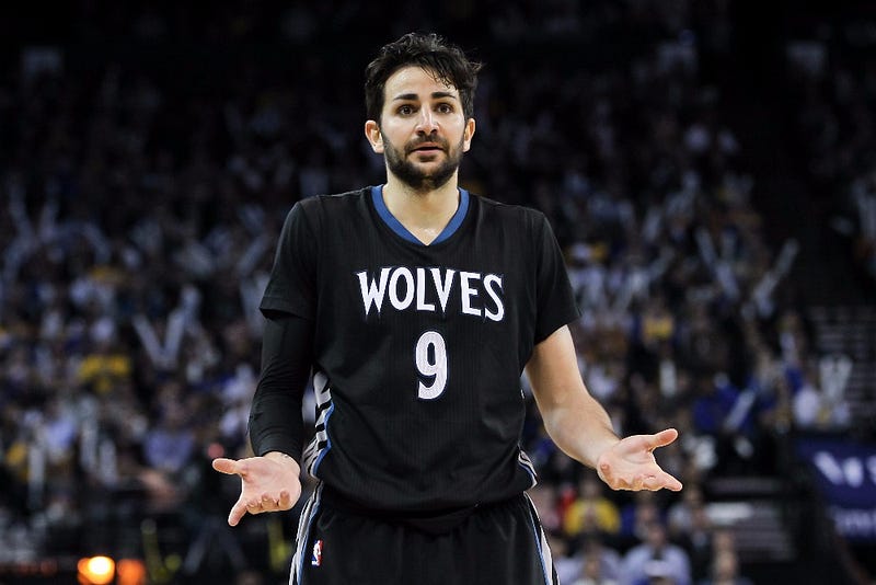
No. 13: 2013-2017 Black (with sleeves)
Black jerseys throughout Wolves history have largely been a great idea. (As we’ll see later in the rankings, even this era’s normal black jerseys were awesome.)
Adding sleeves, however, was not a great idea. It was a four-year experiment from Adidas, the NBA’s previous uniform supplier, and it didn’t exactly take off.
The sleeves ruined what was otherwise a pretty cool uniform (the black version, at least) and just never looked natural on any of the players. The overall design of this era’s jersey was just okay, and sleeves were not the way to salvage them.
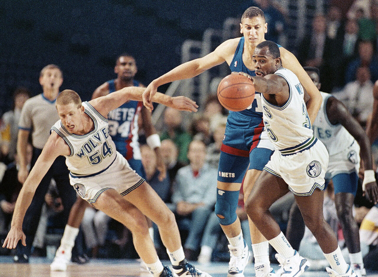
No. 12: 1989-1996 White
The inaugural home jerseys for the Timberwolves were fairly bland. Don’t get me wrong, clean is typically good, but there is a different between clean and dynamic and boring.
The jerseys were framed with a simple border of blue, as was the nickname “Wolves” across the chest — an interesting choice for a team’s inaugural season as the team’s name was/is actually “Timberwolves”. As it turned out, this began the trend of fans simply shortening the team name to “Wolves” more often than not.
Bonus points for the last season of these jerseys also being Garnett’s rookie year.
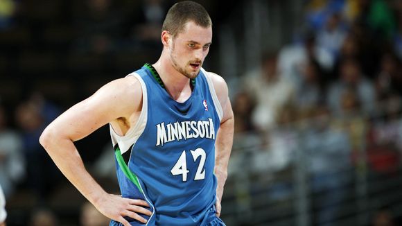
No. 11: 2010-17 Blue
We’ll affectionately call this era the All-Star Kevin Love/Ricky Rubio era.
These jerseys tie with the inaugural threads as the second-longest-tenured designs in franchise history. The overall look and feel of these was unimaginative and felt mostly like an updated version of our No. 14 and 15 jerseys, worn from 2008-10.
That said, they were cleaner and got rid of the overplayed green that seemed forced on the design that was the predecessor.
No. 10: 2010-17 White
Same as above. These were cleaner than the blues but again, felt like a redesigned version of the worst jerseys in franchise history.
Of course, the team had a couple of decent (read: near-.500 seasons) wearing these uniforms, and the Rick Adelman/Love/Rubio era was fun, albeit frustrating for what might have been. So the memories are at least slightly fonder here than with some of the aforementioned jerseys.