

")

No. 9: 2017-Present White (Association)
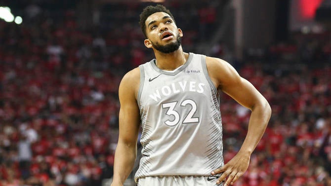
No. 8: 2017-Present Green (Statement)
No. 7: 2017-Present Gray (City)
The jury is still somewhat out on these uniforms, which were only released about 13 months ago.
After all, if the Tom Thibodeau/Karl-Anthony Towns/Jimmy Butler teams go down in flames due to petty grudges and stubbornness, methinks that fans will feel differently about these jerseys in the long run.
But as it is, the team has a 47-35 record in the regular season wearing these jerseys, and made the playoffs for the first time in 14 years.
Plus, the Wolves won their first playoff game in as many years wearing the gray/City Edition jerseys, too. (It’s unclear if the gray jerseys will be worn moving forward or if they were only for the 2017-18 season. They have been removed from the Wolves’ 30th Season website, so stay tuned.)
It’s also notable to point out that 2017 marked the first time in NBA history when teams were no longer assigned “home” and “road” jerseys, and are able to mix and match their designs as they see fit throughout the season.
The overall design is clean, which always wins points in my book, but they also feel a tad … lazy. They bear some striking similarities to the recent Washington Wizards uniforms, which were designed by the same group.
There are some bonus points here for weaving in the new Fitbit jersey sponsorship seamlessly, as well as completely going away from the old and tired, cartoonish font that had been used (albeit with various tweaks) since 1997.
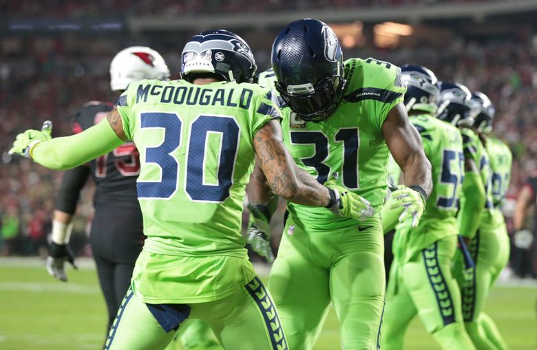
Overall, the green (more accurately, Aurora Green) jerseys have been a fun change of pace. Wearing them every couple of weeks seems about right, and while there are obvious parallels to the NFL’s Seattle Seahawks, it remains a cool alternate.
The gray uniforms are a bit different from the blue/white/green designs in that they do not have the thick, bold lines around the team name. These were cool for a short burst at the end of the year, again as a change of pace.