No. 6: 1996-2008 White
Nostalgia nearly dragged these bad boys into my top five, but common sense won out.
These were the home jerseys during the glory years, when the Timberwolves made the playoffs in eight consecutive seasons. Of course, they lost in the first round in the first eight of those instances, but the 2004 trip to the Western Conference Finals was, by far, the best moment in franchise history to date.
The uniforms themselves fit in the mid-to-late 1990s, as cartoonish fonts and fierce animals were in — see: the Grizzlies and Raptors of that era.
The white wasn’t all that clean, given the business of the font and the treeline around the neck, sleeves, and shorts, and the fierce wolf on the leg of the shorts. But these jerseys worked, and will forever be linked to a Kevin Garnett whose level of fierceness more than matched that of the cartoon Wolf that adorned the uniforms and Target Center court alike.
No. 5: 2010-17 Black (no sleeves)
I realize that this is borderline sacrilegious to pick the jerseys of the floundering Wolves of the 2010s over the Garnett-era home jerseys, but these black jerseys are simply smarter and fresher than the white of the late ’90s and early ’00s.
They were simple, with only a small amount of blue and white framing the clean black look with a simple “Wolves” across the chest.
It was a crime that they only lasted three years prior to the NBA slapping sleeves on them, but these were a good look, plain and simple.
No. 4: 2017-Present Blue
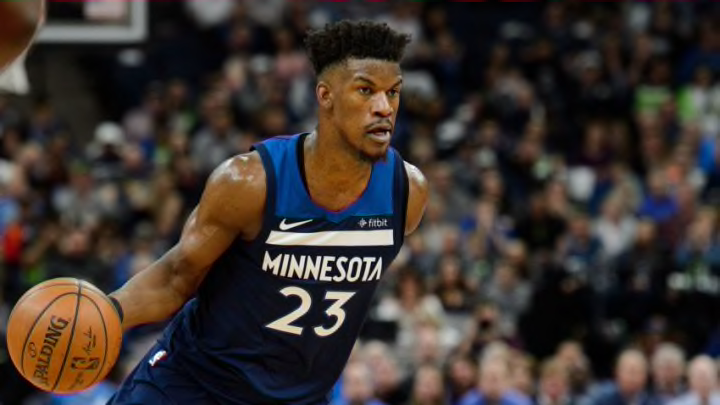
The current Blue, or Icon Edition uniforms, are threatening the top three designs in franchise history.
The framing of the word “Minnesota” across the chest is cool — easily the best jersey with that word across it in team history; the Garnett-era blues (more on those shortly) said “Timberwolves”, even though they were largely used as away jerseys.
The contrasting blues with white accents is clean and bold at the same time. This design is easily the best version of the Wolves’ new Nike jerseys, and it isn’t particularly close.
