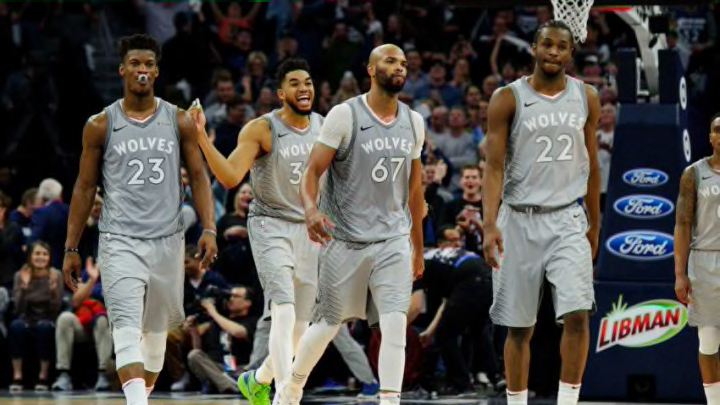
Last Friday night, the Minnesota Timberwolves showed off their 2020-21 City Edition jerseys in their game against the Washington Wizards.
The staff at Dunking With Wolves got together to rank the four different City jerseys that the Wolves have donned since NBA teams switched uniform providers to Nike back in 2017.
Since then the Wolves have worn the above-pictured gray jersey in 2017-18, the purple and black Prince-inspired jersey in 2018-19, the light blue jerseys with “MSP” across the chest during the 2019-20 campaign, and this year’s black North Star jerseys with “MINN” on the front.
The rankings didn’t have specific criteria behind them; our contributors generally considered the overall appearance as well as the history and meaning behind each set.
First, let’s talk about the gray jerseys from 2017-18.
Minnesota Timberwolves Gray City Edition Jerseys, 2017-18
Paul Langan: No. 4
All four jerseys on this list are good-looking jerseys for the most part, but this is my least favorite. Yes, they are supposed to look like the gray coat on a wolf, but it’s just a bit boring and plain. I like the pattern on the side and the white text but that’s about it.
Kayne Rob: No. 3
These were simple but still gave the sleek feel of a real Wolf which I respected. Especially for the first year of City Edition jerseys, it was a nice simple yet cool look.
Adam Jacobs: No. 4
These jerseys would be higher on the list if the jerseys that came after them weren’t so solid. It was a great idea to use the color of an actual timberwolf along with the designs to make it look like rips or large tears, but it just fell short.
Compared to the other jerseys on this list, it didn’t have a history, didn’t have a story, and didn’t have anything interesting to really go with it. Cool look, but lack of anything else puts it last on the list.
