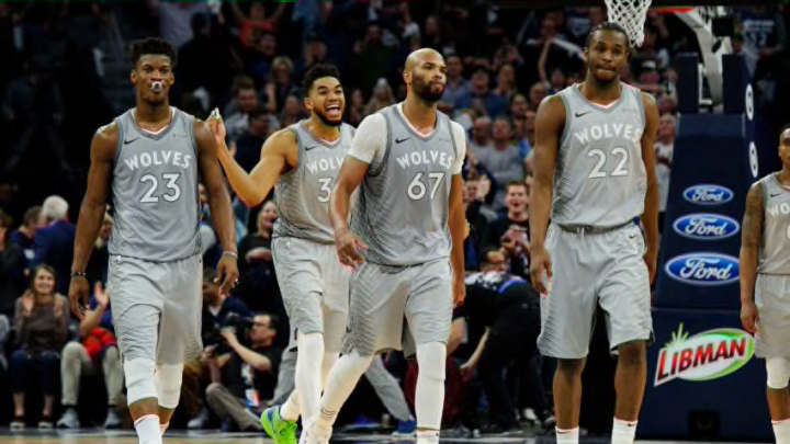
Minnesota Timberwolves Prince City Edition Jerseys, 2018-19
Paul Langan: No. 2
There might be a few raised eyebrows on this in comparison to the consensus, but these simply aren’t my favorite City Edition jerseys. Still, the font and the mix of colors work well. Most importantly, the meaning behind the jersey and the representation of late Minnesota music legend Prince, who passed away in 2016, was a great way to honor him.
Kayne Rob: No. 1
Representing a Minnesota icon that was so widely recognized was awesome. The look was sleek and it was apparel I made sure to grab before it was gone.
The font of the jerseys was sleek and had a swagger to it. The only thing the team could have done better is changed the hardwood for the games to match the purple look, similar to what other teams are doing around the league. Up there for best City jerseys league-wide that year.
Adam Jacobs: No. 1
The state of Minnesota was hit hard by Prince’s sudden death in 2016. The musician was a frequent presence courtside during Wolves and Minnesota Lynx games, and the Wolves responded perfectly.
In collaboration with the Prince estate, the Wolves designed each element of these jerseys as a nod to an icon. From the names and numbers modeled after his logo and font, to the flashy right shoulder design as a nod to his jacket from “Purple Rain”, to the color combo, which were colors closely associated with Prince.
All the elements, nods, and small things on the jersey just point to the thought and effort that went into this design. The biggest win of them all in my book.
