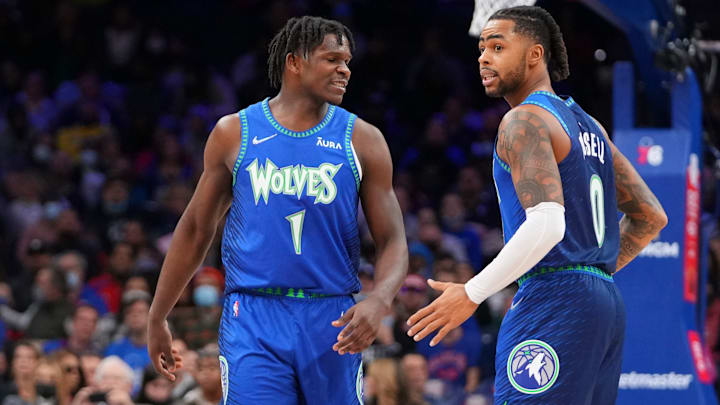
Minnesota Timberwolves fans are well aware that their team has some of the most pleasing-to-the-eye uniforms in the history of the association. The Timberwolves may not have been around as long as a lot of teams, or have as much of a winning history as other franchises. But they probably outdo nearly every one of their peers when it comes to stylish jersey designs.
Since Nike took over production of NBA jerseys in the summer of 2017, Minnesota has had at least one new jersey designed each season, branded as the "city edition" jersey. Some of these have been hits, while others have been misses. But we decided to rank all eight city edition jerseys, starting with the worst and ending with the best.
The Timberwolves’ 2017-18 city edition jersey pic.twitter.com/jhPkaP5dp4
— Will Eudy (@WillCEudy) December 12, 2024
#8 - 2017-18
This was the very first city edition uniform the team put out, and it honestly gives off the impression that the Wolves were not really sure what to go for. This feels in hindsight like a "feel it out" design, and it did not end up being much of anything. The all-gray design is a bit bland, and it feels easy to give this one the bottom spot on the list.
The Timberwolves’ 2022-23 city edition jersey pic.twitter.com/mBJxIO48gH
— Will Eudy (@WillCEudy) December 12, 2024
#7 - 2022-23
This one has a bit more life to it, but not by much. It was intended to honor Minnesota's local artists and creators, but most thought that the design just looked a bit wonky, with the color scheme not really matching that of the Timberwolves'. One cool thing with this one is that each individual jersey design was actually slightly different, thus making each one unique. That tidbit saves this design from finishing last on our list.
The Timberwolves’ 2019-20 city edition jersey pic.twitter.com/9BIoqNZbDz
— Will Eudy (@WillCEudy) December 12, 2024
#6 - 2019-20
Now we finally get to one that actually seeks to draw primarily from the Timberwolves' standard color scheme. But even so, there is not a lot that is interesting about Minnesota's 2020 city edition uniform. The 'MSP' is of course a reference to the city's airport code, and the asymmetrical design is different. Other than that, this one is still pretty forgettable.
The Timberwolves’ 2023-24 city edition jersey pic.twitter.com/akIVFAtBC2
— Will Eudy (@WillCEudy) December 12, 2024
#5 - 2023-24
The first of a two-part city edition series, the 2023-24 city edition jersey took inspiration from Minnesota's nickname of the "land of 10,000 lakes," which is actually a really cool niche to lean into. The watery design was meant to symbolize lake life in Minnesota in the summertime. While not good enough to crack the top four, this design is definitely one of the better ones put out by the team.
The Timberwolves’ 2020-21 city edition jersey pic.twitter.com/3eB0a9MkHa
— Will Eudy (@WillCEudy) December 12, 2024
#4 - 2020-21
Some are not as big a fan of this one as I am, but the 2021 "MINN" design with the green stripes and the north star dotting the "i" is one of the most accurate representations of the Timberwolves' brand on this list so far. This one gets also gets an extra bump for its memorability since it was worn in Anthony Edwards' rookie season.
The Timberwolves’ 2024-25 city edition jersey pic.twitter.com/Ty6kGNSaus
— Will Eudy (@WillCEudy) December 12, 2024
#3 - 2024-25
The second of the two-part "lake" series, this one is far superior to its older brother. While the concept of these two jerseys was cool as a whole, the "ice" version looks much cleaner and is a more accurate representation of life in Minnesota, given how cold it is for the majority of the year.
The Timberwolves’ 2018-19 city edition jersey pic.twitter.com/FvTIS8WQgY
— Will Eudy (@WillCEudy) December 12, 2024
#2 - 2018-19
An homage to legendary Minnesota-born singer Prince, the purple jerseys are some of the Timberwolves' most memorable and beloved of the last decade. Only one design can claim to be better than this one.
The Timberwolves 2021-22 city edition jersey pic.twitter.com/Ic3AGOKoug
— Will Eudy (@WillCEudy) December 12, 2024
#1 - 2021-22
There is simply no outdoing this one. The two shades of blue surrounded by the green tree trim and a stylized "Wolves" logo using font from the 2000's jerseys is simply chef's kiss. Add in the chrome Nike swoosh used during the NBA's 75th anniversary season, and the only way the Timberwolves could do better than this is by bringing back the black alternates from the 2003-04 season.
